

DevLake is a compelling offering. It collects and normalizes data from many of our favorite development tools and visualizes it using Grafana dashboards. Like the sleuths we are, we feel the urge to look beyond the dashboard overviews and find the golden nuggets buried deep within the data. So, we'd like to introduce the DevLake Playground, a place where you can unleash the power of Python on your data.
In the DevLake Playground, we can explore the data using Jupyter Notebooks. There are some predefined notebooks and you can write your own. A Jupyter notebook combines Python code and documentation, which you can easily customize to your needs with some tweaks. The benefits of these Jupyter notebooks as opposed to Grafana are:
- Grafana is limited to SQL queries for gathering and transforming data, and visualizations for data tables.
- Python (code) offers more flexibility in transforming the data and can easily provide feedback on intermediate steps.
- The playground also supports more visualization types; for example (see the first use case below,) when the data is structured as a graph, we can visualize it with Graphviz.
Use cases
Analyzing the development process through JIRA statuses
The DevLake Domain model exposes the changes of issues of our issue tracker, including status changes. If we use that to visualize how issues really flow, we get a rudimentary (automated) value stream map. We can use this to identify bottlenecks in our process or flaws in our process design. This is inspired by this blog post:
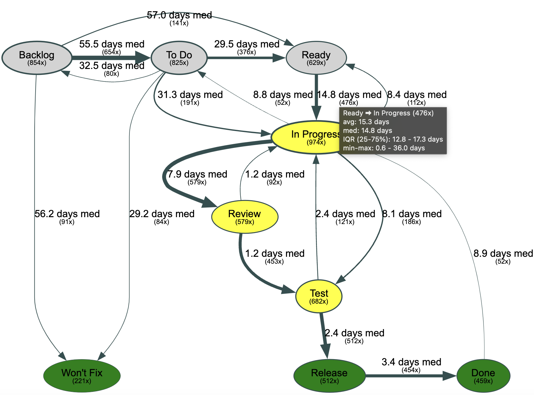
For example, in the chart above, we see that it takes on average 15 days for Stories to go from "Ready" to "In Progress". And, it happened 476x within the selected time frame.
And now that we have this data in our playground, we can easily change how we represent it. If we focus on the most common status transitions, we can visualize the distribution of durations in a box plot out of the same data:
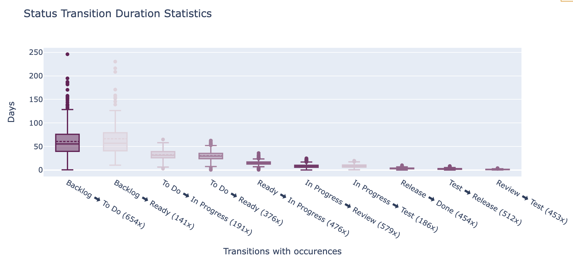
This functionality is made available through a predefined notebook, so you can easily run it with your own data.
Explore data across different domains
Let's say we have a hypothesis: "Defect fixes are more quickly merged than new functionality." Before building a dashboard, we want to determine whether the data quality is good enough and whether we can test this hypothesis. With pandas, we can quickly join different tables from the data model. With the following code, we were able to get a preliminary view:
import pandas as pd

from playground.db_engine import create_db_engine

# the default notebook
DB_URL = "mysql://merico:merico@127.0.0.1:3306/lake"
engine = create_db_engine(DB_URL)

# read tables from database
df_pr_issues = pd.read_sql("select * from pull_request_issues", engine)
df_prs = pd.read_sql("select * from pull_requests", engine)
df_issues = pd.read_sql("select * from issues", engine)

# join pull requests and issues based on rows in pull_request_issues
df = pd.merge(df_pr_issues, df_prs, left_on="pull_request_id", right_on="id", suffixes=('_pr_issues', '_prs'))
df = pd.merge(df, df_issues, left_on="issue_id", right_on="id", suffixes=('_prs', '_issues'))

# set data types correctly
df['created_date_issues'] = pd.to_datetime(df['created_date_issues'])
df['resolution_date'] = pd.to_datetime(df['resolution_date'])
df['created_date_prs'] = pd.to_datetime(df['created_date_prs'])
df['merged_date'] = pd.to_datetime(df['merged_date'])
# calculate lead times
df['issue_lead_time'] = df['resolution_date'] - df['created_date_issues']
df['pr_lead_time'] = df['merged_date'] - df['created_date_prs']
# drop unnecessary columns
df = df[['type_issues', 'title_issues', 'issue_lead_time', 'title_prs', 'pr_lead_time']]

# group lead times by issue_type, add count
df_grouped = df.groupby('type_issues').agg({
    'title_issues': 'count',
    'issue_lead_time': ['mean', 'median', 'std'],
    'pr_lead_time': ['mean', 'median', 'std']
})
df.rename(columns={'title_issues': 'issue_count'}, inplace=True)

display(df_grouped)
If we run this example on the Devlake GitHub issues and pull requests (up to March 2024), we get the following output:
| title_issues | issue_lead_time | pr_lead_time | |||||
|---|---|---|---|---|---|---|---|
| count | mean | median | std | mean | median | std | |
| type_issues | |||||||
| 34 | 66 days 14:53:28.709677419 | 42 days 05:59:04 | 67 days 14:35:49.143870568 | 3 days 11:42:34.857142857 | 0 days 12:54:43.500000 | 12 days 17:24:54.878541108 | |
| BUG | 141 | 10 days 07:27:20.572463768 | 1 days 22:42:39 | 20 days 14:51:35.075965706 | 1 days 16:51:51.529411764 | 0 days 01:04:54 | 10 days 10:20:54.566875184 |
| INCIDENT | 2 | 0 days 00:50:49 | 0 days 00:50:49 | 0 days 00:59:50.688234865 | 0 days 00:06:39 | 0 days 00:06:39 | 0 days 00:00:42.426406871 |
| REQUIREMENT | 40 | 37 days 02:50:22.500000 | 16 days 03:56:45.500000 | 60 days 02:39:39.606995949 | 9 days 11:13:27.270270270 | 2 days 00:14:04 | 22 days 12:32:27.522638402 |
Getting started
We hope you are as excited as we are. We look forward to you joining our community to get your feedback and contributions.
Want to get started? Have a look at the playground repository.